FINISHED 4/4
Article Response – Homework Task
Why do you think the developers chose these art styles?
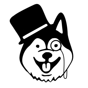
Super Time Force: Originally this game was created for a Game Jam which is a event were many people participate in to create a game within a short amount of time. They couldn’t have time to create a art style as they were in such a rush. Although after the Game Jam they wanted to make their art style to reflect on their development team.
Dark Stalkers: Capcom as a larger company would have more of a focus on art style as they have the time and also budget can support it. They also wanted to make their characters to be completely different from one another to make the unique and also stand apart from one another. They focused on a more Gothic like style with some of the characters and used a lot of stretching and squashing to achieve their animation style too.
What creative problems do pixel artists face? What problems does pixel art present as an art style?
In pixel art you will be sacrificing certain things such as fine detail, as an example face detail may be sacrificed to give the character more shape or even more exaggerated animations. Also they would have to think of ways to make the character sprites stand out from the background which could be anything from illumination or desaturate the background all together to make the characters more visible and not blend into the background canvas.
What are the advantages of pixel art as an art style?
Making a pixel game isn’t as hard on the computer as it would be making a fully 3D game, It requires less memory and graphical power which means that lower end hardware could play it and also the developers computers don’t have to be these powerful machines. Now-a-days people use it to tap into the nostalgia market which is a ever growing population of people who enjoy those kinds of games.
What problems do animators using pixel art face?
Complexity of the sprite could make animation difficult as you are working with finer pixel placement, as an example if you have a extremely detailed and shaded sprite it will be more difficult to make fluid animations without it looking like a mash of pixels.
What are the advantages of using pixel art for animation?
You can use things such as stretching and squashing without creating a rig for a 3D character which would take more time and also resources. If you are in a indie team that also means you would hire less people as you wouldn’t need to have a rigger in your team.
How do the requirements of game genre, technology and players affect creative decisions?
Game genre is aimed at a certain audience which enjoys that certain genre, People like various things and with games people are fond of sticking to the genre they enjoy. Game genre has a massive impact on the art direction and also plot/story to the game. Now technology has gotten to a point where pixel games are as well optimised as they could be, although some engines don’t allow for extremely complex procedures. The player is a massive impact on how the game turns out, you can have all of the freedom you want when creating a game but you do have to keep in mind the player, you wouldn’t hide something so out of place that only you know about it.
What creative decisions did they make in tackling these problems?
Super Time Force did change their art style, as an example they made the cars go from 2D and made them 3D, placing them at a slight angle creating a unique look to them. The game itself is quick and a massive havoc most of the time. Having a lot of things happening on the screen in a single given time. They changed it from being a chaotic to a more controlled and organised chaos.
Dark Stalkers had to make a good fighting game, they used things such as stretch and squash which is commonly used when animating in 2D to give more emphasis on the actions. They wanted to create characters that are unique and flow well with the animation.
What were the alternative solutions?
Super Time Force could of went in a slightly different route, offering a higher amount of pixels to work or even a vector style of art. The reason they went the way they did was due to the game being entered into a Game Jam which has strict deadlines and a short period of time creating the game, it would mean working at a higher pixel density would take longer same with vector style.
Dark Stalkers was extremely limited by the technology at the time and couldn’t experiment and be as complex as they might of originally went. They could of went into photo realistic imagery when creating their game similar to the original mortal combat, where they would take actors and take pictures of them in different stances.
Pixel Art Animation – Walk
We were tasked with creating a walk animation in pixel art which proved to be challenging. We had to work on a canvas size of 24×24 pixels but the character has to be 8 pixels high in his idle stance. We did two different walk styles which I will be demonstrating and showing my process of both of them.
Basic Walk Animation
The basic walk animation wont be using any squashing and stretching techniques which are used to exaggerate movements within the animations. I started off with setting up the canvas, the preference in Photoshop and set up the timeline. I made the canvas 24×24 pixels and made sure that the ruler was set to pixels instead of centimeters. I changed the background colour to a neutral one (grey) so that the bright white background wont affect my eyes and alter what I see.
I then created my character on a separate layer and made sure I gave his opposite limbs a darker shade, not only to give the character depth but also if the limbs overlap they don’t mash into a single mess of pixels. I also tried to make him stand in the most neutral position I could so I can later animate him how I wanted to.
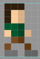
Once I created him I then duplicated him onto another layer and proceed to do the frames of the walk animation. I wanted to make it fluent and only focused on the foot movement to begin with. To make sure the walks are accurate I took some steps to figure out how people move and if it’s correct. I had to make sure the lighter leg was always in front of the darker leg as the darker leg is behind the lighter leg. I needed to animate 2 steps in order for it to complete the loop animation.


I created each frame on a different layer in order to save time and also to not have to remake the character which can mean the pixels may not be the colour I wanted originally.
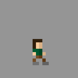
After I done all the frames I needed to put them into a timeline and make them play at 0.1 seconds each frame to make it slow enough to see the individual scenes without blurring into one another. Once I checked everything and made sure it’s how I wanted it I exported it as a GIF and here is the final version:
Advanced Walk Animation
I did the same process as before but this time I wanted to introduce stretch and squash into my animation to make it look more exaggerated and try to give my character more personality.
I used the same walk animation as before but I edited by adding stretching and squashing to the head and the legs.

Final logo graphics
We were tasked with creating our finalised logo and name for the chosen logo from our group. I designed my to look elegant and not too flashy as.
I started off by opening up Photoshop which will be my software I use to create the logo, I had to take my reference which my group member made.

This logo needed some refinement but I kept to the originality of the first creation which my fellow group member created. I wanted to make it look as sleek and presentable as possible with no contrasting colours and just a simple look to it.
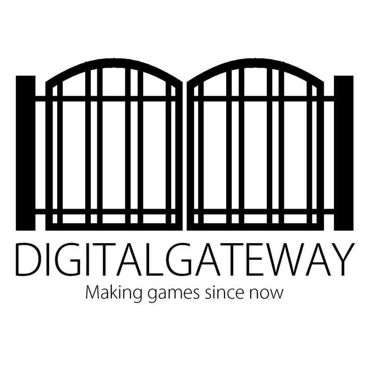
The image above is the final logo which I created, it took two attempts as the other one was corrupted and I completely lost all my work for that piece. I didn’t get a chance to put it up onto WordPress as we were leaving and it was still a Photoshop file.
I went for a minimalist style which means a simple style without many colours but in my case non at all and only a solid black. I wanted the logo to stand out and that it was clearly a gate. To create the logo I used line tools and made them thicker to make the beams of the gate. For the arch of the gate I took a line and I warped it which was harder than expected as it would create distortions and it still has some distortion in the final image.
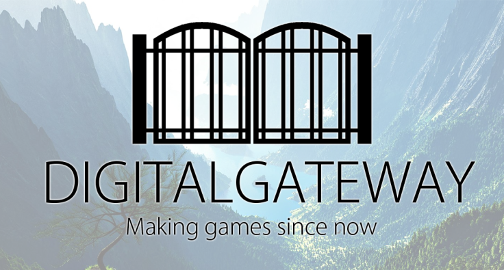
The logo above is the one we will use for our social medias, I made the logo smaller in order to make the text still viable and clear for the user to read on a horizontal landscape. I made the background in a sense of it being a gate to paradise and once you open it many greats things will come.
Overall I really like how this logo came out but the distortion is a little bit too noticeable which isn’t good. You can see it getting thicker in the middle and one the ends it starts to thin out. In the end I think it turned out well and it’s good for what we are doing.
Reflection on the week
This week we’ve done tasks which would help us with the game but the main focus was research. The Deathstalkers and Super Time Force report gave us an insight on how pixel games are made and also tells us the benefits, disadvantages and also problems pixel games have. It made us think more about the development of our games. We practiced working on animation which will definitely be used for our game development. It enhances our skills when designing characters and also teaching us some things about animation such as stretching. We also designed our final logos which the group decided on, I feel like this went good and didn’t take much time.

February 2, 2017 at 11:42 am
Work to be posted onto the blog – WEEK 3
Darkstalkers and Super Time Force report- Great start to the report- include the articles as link and explain the task as an intro. Ensure that you are responding with your own opinion as well as analysing the task. Images perhaps to assist with this? Complete the rest of this also.
Skills Task 3 – Pixel Art – Animation- : Lovely animation, you have shown you understand the technical requirements. You need to break the processes down further and show the problems and the solutions you have faced. Again, talk visually about the colour palettes and the formal elements.
Finalised Team logo and production name- Not on blog- complete
Reflection on the work undertaken in week- not on blog- complete
Work to be completed on Social Media Platforms- Post your Pixel Art Animation- complete
LikeLike
February 15, 2017 at 2:17 pm
Work to be posted onto the blog – WEEK 3
Darkstalkers and Super Time Force report- Good start to the task, you have started to analyse what has been written in the articles and discussing this well. You need to continue and finish this off however. Include images of the games and don’t forget to reference.
Skills Task 3 – Pixel Art – Animation-Your pixel art animation was well executed and have shown a clear progression with the character visually. I think you could go back to this and discuss the problems you may have faced along the way and how you dealt with them. Reflect upon your progress also.
Finalised Team logo and production name- Not on blog, to complete.
Reflection on the work undertaken in week- Not on blog, to complete.
Work to be completed on Social Media Platforms Pixel Art Animation- Not on blog, to complete.
LikeLike